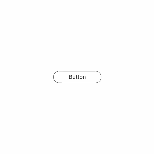
ホバーすると丸が拡大するボタン
ホバーJavaScriptボタン
ホバーするとボタン内の丸い円が現れて拡大し、ボタン色を変えるアニメーションです。
実装のポイント
ボタンの背景に丸い円の要素を配置し、ホバー時に拡大させることで、ボタン全体が拡大しているように見せています。この処理自体はボタンに入ってきたmouseenter時と出ていくmouseleave時にだけで大丈夫です。
丸い円の大きさはコード例では固定値の400pxにしていますが、ボタンの大きさに合わせて変更してください。あまり大きすぎると一瞬で拡大してしまうので円が広がっているのを感じにくくなってしまいます。
コード例
HTML
<button class="sampleButton">Button<span class="bg"></span></button>
CSS
.sampleButton {
  --button-bg-color: #363636;
  --button-text-color: #363636;
  --ease-out-quart: cubic-bezier(0.25, 1, 0.5, 1);

  position: relative;
  z-index: 0;
  overflow: hidden;
  color: var(--button-text-color);
  border: 1px solid var(--button-bg-color);
  @media (any-hover: hover) {
    transition: color 0.5s var(--ease-out-quart);
    &:hover {
      --button-text-color: #fff;
      .bg {
        scale: 1;
      }
    }
  }
}

.bg {
  display: block;
  position: absolute;
  top: 0;
  left: 0;
  z-index: -1;
  width: 400px; /* ボタンを覆い隠すのに十分な大きさ */
  height: auto;
  aspect-ratio: 1;
  background-color: var(--button-bg-color);
  border-radius: 50%;
  scale: 0;
  transform-origin: center center;
  margin-top: -200px; /* 大きさの半分 */
  margin-left: -200px; /* 大きさの半分 */
  transition: scale 0.5s var(--ease-out-quart);
}
JavaScript
const buttonElement = document.querySelector(".sampleButton");
const buttonBgElement = buttonElement?.querySelector(".bg");

const handleMouseEnterLeave = (event) => {
  if (!buttonElement || !buttonBgElement) {
    return;
  }
  const mouseTop = event.offsetY;
  const mouseLeft = event.offsetX;
  buttonBgElement.style.translate = `${mouseLeft}px ${mouseTop}px`;
};

buttonElement?.addEventListener("mouseenter", handleMouseEnterLeave);
buttonElement?.addEventListener("mouseleave", handleMouseEnterLeave);