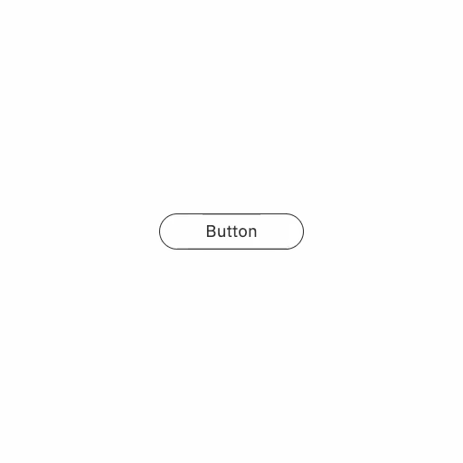
波紋が広がるリップルボタン
クリックJavaScriptボタン
クリックするとボタン内の丸い円が波紋のように広がるアニメーションです
実装のポイント
クリックで座標を取得し、その一で内部のリップル要素のCSSアニメーションが実行されます。CSSアニメーションは実行用.isPlayingクラスを外したあと、requestAnimationFrame()を二重に実行するして再度クラス名をつけ直すことで初めからCSSアニメーションを実行できます。詳しくはCSS アニメーションのヒントとコツ - Web API | MDNにて解説されています。
コード例
HTML
<button class="sampleButton">Button<span class="ripple"></span></button>
CSS
.sampleButton {
  position: relative;
  z-index: 0;
  overflow: hidden;
}

.ripple {
  --ease-in-sine: cubic-bezier(0.12, 0, 0.39, 0);

  display: block;
  position: absolute;
  top: 0;
  left: 0;
  z-index: -1;
  width: 550px; /* ボタンを覆い隠すのに十分な大きさから少し大きめ */
  height: auto;
  aspect-ratio: 1;
  background-color: color-mix(in srgb, currentColor, #fff 75%);
  border-radius: 50%;
  scale: 0;
  transform-origin: center center;
  translate: -50% -50%;
  animation-duration: 0.5s;
  animation-timing-function: var(--ease-in-sine);
  animation-iteration-count: 1;
  &.isPlaying {
    animation-name: rippleEffect;
  }
}

@keyframes rippleEffect {
  0% {
    scale: 0;
    opacity: 1;
  }
  100% {
    scale: 100%;
    opacity: 0;
  }
}
JavaScript
const buttonElement = document.querySelector(".sampleButton");
const rippleElement = buttonElement?.querySelector(".ripple");

const handleClick = (event) => {
  // 要素の境界ボックスを取得
  const rect = buttonElement.getBoundingClientRect();

  // 要素内における相対的なクリック座標を計算
  const x = event.clientX - rect.left;
  const y = event.clientY - rect.top;

  // リップル要素にその座標をあてる
  rippleElement.style.left = `${x}px`;
  rippleElement.style.top = `${y}px`;

  // アニメーションを実行する
  rippleElement.classList.remove("isPlaying");
  requestAnimationFrame(() => {
    requestAnimationFrame(() => {
      rippleElement.classList.add("isPlaying");
    });
  });
};

buttonElement?.addEventListener("click", handleClick);